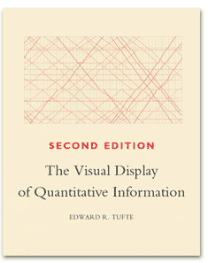
I recently bought a copy of The Visual Display of Quantitative Information by Edward R. Tufte (Graphical Press LLC, Cambridge, USA). Tufte's website gives quite a bit of information on his publications.
Edward Tufte has written several books, generally on the effective graphical display of data. This volume is the first of a series of four, and was originally published in the late 80s (I have the second edition, fourth printing, 2006), before the appearance of Microsoft's PowerPoint application. As I shall discuss in a later article, Tufte is vehemently opposed to the use of PowerPoint. (My own opinion is that PowerPoint enables one to quickly prepare a presentation: how effective the presentation depends largely on how much forethought has been devoted to the presentation before composition starts). More on the PowerPoint debate in a later article, perhaps.
Here, Tufte provides a clear and frankly beautiful exposition on the display of information. In Part 1, he presents examples of graphical excellence, including something of a historical treatment. Significant here is what must be his favourite chart, Minard's chart of Napoleon Buonaparte's disastrous Russian campaign of 1812. Tufte just loves this chart, not only does it feature in this book, but it reappears five times in Beautiful Evidence, the fourth book in this series - I will review this book as well. Tufte follows these examples with a chapter extolling the need and virtue of Graphical Integrity, in which he gives a variety of examples of dubious data presentation.
However, it is in Part 2 that we see the real meat of the text, and we are provided with clear guidance for best chart design, through six chapters. I have to say that for me at least eventually his strictures against too much ink on charts go a little too far, and deviate far enough from normal styles of data presentation that they become rather harder to comprehend.
Overall this book would score the highest marks for presentation, content, and general interest. Very highly recommended.
